


I can't believe I'm learning this stuff only now. Well, better late than never
I always pick colors with no consideration on how colors works, and hide the mess with gradients and blend modes, like putting sprinkles on a burned cake
So I'm now studying! >:(
No more blend modes! No more gradients! Until i know how to color at least!
1st pic :
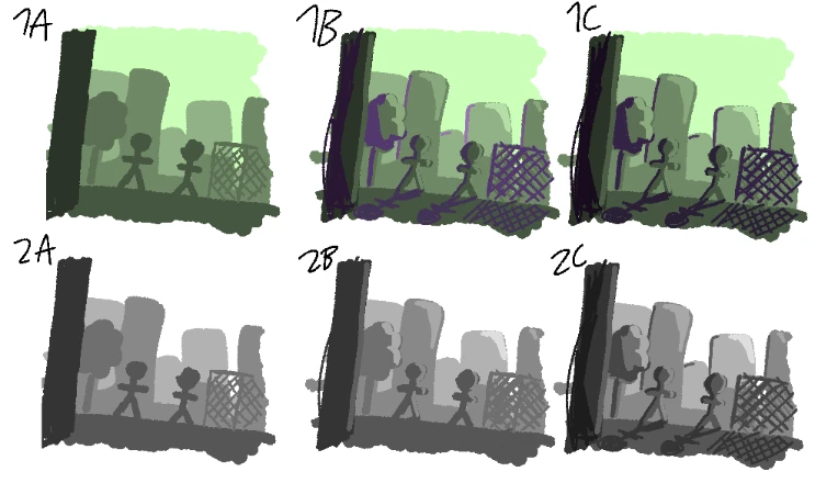
I tried to draw with value in mind. I read that the farther something is, the higher is its value. So i drew 1A, and set Saturation to 0 in 2A to see how it worked.
I then wanted to draw shadows. I don't know where I read this but it's something that was... Like sitting somewhere in my head lol like a random memory of some random tip. I picked the opposite of green on the color wheel (which is purple). It's something about cold/warm colors being at the opposite of the color wheel I guess
I drew 1B but something was wrong and i was right, 2B shows than the shadows values are mixing. So I drew 1C with more saturated shadows. It still look weird though I don't know why
But 1A look very good! :)
2nd pic :
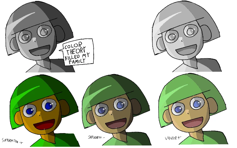
Trying to understand how saturation and value impacted colors.
She look like a very old 3D character lol
Finasty
For me, i always use a light color to make it not too saturated, and the rest is just play with the color itself