


Mmmmmh
cubes
Pic 1 :
This time i was trying to color a simple cube. I started with 1 (cause it's the 1st duh), which allow me to know how values works.
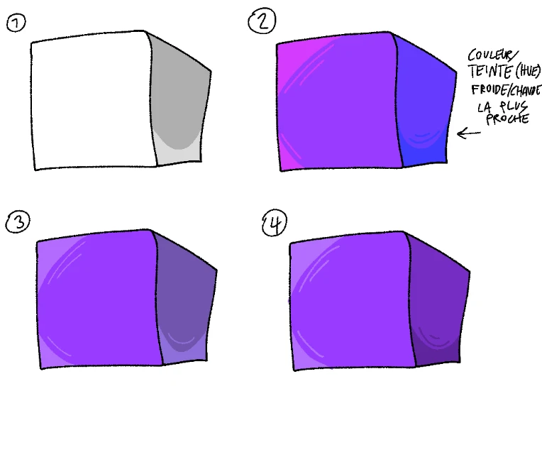
Then I wanted to try with colors. 2nd was drawn by using the closest cooler colors for shade and the closest warmer colors for light, without changing the value.
3rd was drawn using the 1st cube values as base, and 4th by only changing the contrast.
2nd pic:
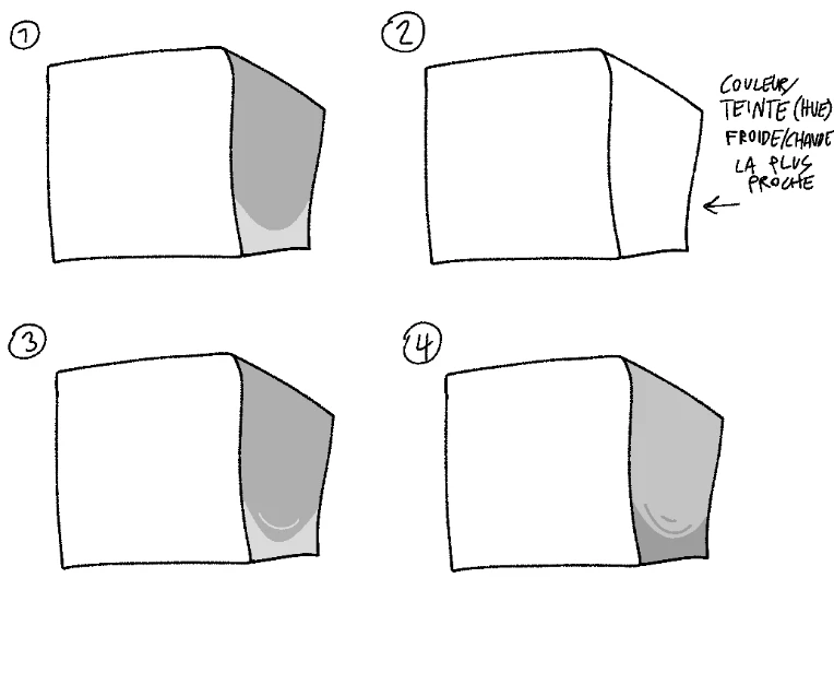
I set the canva saturation at 0.
As you can see, 4th is a catastrophe. It's ugly. Boooo. Shading by varying the contrast is a bad idea.
3rd is very well made. We love 3rd. Do you love 3rd? Of course you do. I love the side's color.
But now, something that I can't understand : 2nd look very good in colors, although the values are the same.